
One name comes to the forefront in children’s literature, where creativity is unrestricted: David Salariya, known for founding The Salariya Book Company in 1989.
The publishing industry is unrecognisable since he started working in 1978, there were no computers, no internet so publishing worked in a completely different way to the way work is done now. Here we take a look behind this ‘ideas man’ and gain an insight in an exclusive conversation as he gives insights into the components of publishing that give his works life.
The Fundamentals of Books with “Words and Pictures”
David Salariya highlights the importance of artwork in children’s books with a gleam in his eye. He repeated Alice’s question, “What is the use of a book without pictures?” in a similar tone. Salariya’s world is a fully immersive experience which captivates young minds through his use of words and ‘pictures’.
David Salariya creates, writes, illustrates, and published prize winning books which enthralled, educated, and entertained. A significant portion of David Salariya’s portfolio of work is non-fiction. He is best known for his bestselling “Spectacular Visual Guides” series and the “You Wouldn’t Want To Be…” series, which are sold globally and have been translated into numerous languages and his publishing house is seen as the home of creativity, inspiration and amazing adventures through history.
Youngsters have an insatiable curiosity for the world, asking questions and seeking explanations for everything they encounter. Salariya’s books inspire kids to learn more about the amazing world they live in by taking them on fascinating journeys into different worlds, fusing information with spectacular illustrations, and design. So the anatomy of what makes a good book design for a young reader.
“When a child picks up a book, the cover is their first glimpse into the adventure awaiting them,” says Salariya with regards to book cover design. Babies like faces – perhaps in black and white or abstract face shapes. Young children are drawn to bright block colours, minimalist cartoonish style artwork, familiar characters like pets and animals, and large words. Of course, the draw will be anything they have seen on TV or a tablet – hence the dominance of well-known cartoon marketing. However, the cover also has to appeal to the buyer – the child does not have the buying power of money.
The cover establishes the mood for the entire journey inside the pages to the interior book design: Salariya emphasises how important well-thought-out interior book design is. “It’s about creating a seamless flow, ensuring that each page complements the narrative and keeps the reader engaged,” he says. The secret to encouraging a child’s love of storytelling is a well-balanced combination of words and graphics – a clear indicator of where main text starts is needed and a large cap or making the first words in a sentence of the main text gives a child a good indication of where the sentence begins. Bite size captions clearly indicated with a small triangle is a good symbol for indicating which caption goes with which picture and is good for saving space.
Graphic design is essential to publishing in its larger sense. “The way the illustrations flow is crucial,” says Salariya, and keeping a consistent visual design for a series over many volumes to create an identity is important for brand awareness and forges a closer bond with your young readers.
Book Design and Layout: The story is formed in the layout, which serves as a canvas. “A well-thought-out layout enhances readability and comprehension,” says Salariya.
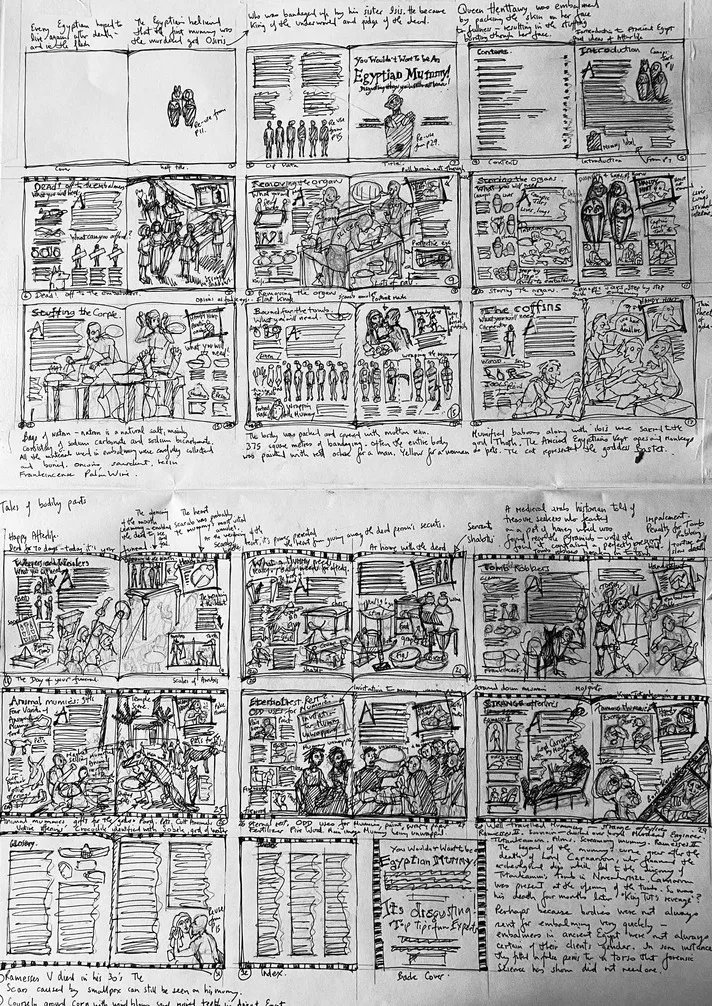
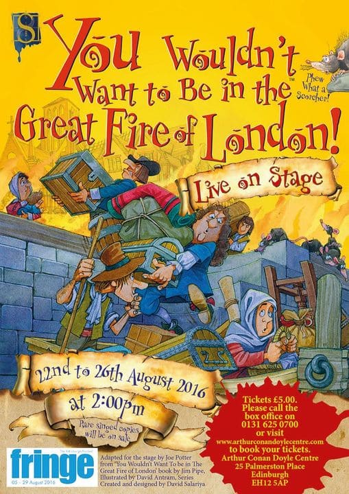
Rough thumbnail sketches by David Salariya at the planning stage of the series ‘You Wouldn’t Want To Be An Egyptian Mummy’ which he created and designed in 1999. The ‘You Wouldn’t Want to Be…’ series went on to include over 70 titles, published globally – and is translated into over 35 languages and a couple of stage shows (Poster below). The series had multiple authors including David Salariya writing as David Stewart and were brought to life by the wonderful slightly anarchic illustrations by David Antram.
Creating an immersive reading experience involves balancing text and graphics, taking the narrative’s rhythm into account, and adding visual interest.
Book typography Salariya highlights typography as highly important in the mix of designing non-fiction for 7-year-olds. “Main text fonts must be inviting and easy on young eyes who are learning to read, but not too babyish, open a’s and e’s are good,” but ‘headings and dropped caps can be used to make the page exciting – these do not need to be desperately legible as they add to the appeal of looking as if aimed at an older age group” he argues. Children who are discovering the joys of non-fiction will really engage with books which are thought about carefully – and always think about how difficult it is to learn to read when designing a book for fledgling readers.
Books created by David Salariya will always be entertaining and educational, he counts himself fortunate to have worked with such highly talented experts and authors over the years among his colleagues, such as Jacqueline Morley, Fiona Macdonald, and John Townsend, with the talented illustrators: Carolyn Scrace, Isobel Lundie, Mark Bergin, John James, David Antram, and Nick Hewetson, and of course, the editors Karen Barker-Smith and April McCrosky who brought many complex subjects together.
Every inquisitive young mind can find a book in David Salariya’s portfolio, from board book series for the youngest readers to illustrated non-fiction for middle-grade and teen readers.
Final Thoughts: David Salariya’s thinking goes beyond simple narrative in the realm of “Words and Pictures” books. It’s all about using a thoughtful combination of words and images to kindle a passion for reading. Publishers and creators aspiring to be great, take note: it’s not just about the story, but also about the meticulous planning that goes into each and every visual component. The world of children’s publishing is all the wiser for David Salariya’s leadership, providing young readers with an unending supply of exciting new experiences.
Find out more: www.davidsalariya.com
